As we began to define Project Darwin and discuss potential changes in site layout, one thing became clear: the ever-growing number of users on tablets demands a tablet experience that lives up to its use. In August 2013, almost 8% of the total traffic on Wikia came from tablet devices. 6 months ago, that number was just slightly over 6% and current trends point to a steady increase in tablet page views over the coming months.
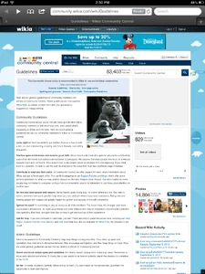
Currently (without fluid layout), tablets get what looks like a "zoomed out" version of what you see on desktop computers. This makes an article tiny and hard to read, while links and buttons are small and hard to click. Readers usually need to use multitouch gestures to zoom in on the article content area in order to get a comfortable reading experience, and have to repeat that action with every new page that loads. Here's what Wikia looks like on an iPad today:
As tablet page views grow to become a large audience of users on Wikia, we need to improve the tablet experience. At any device size, the content of the page should be the focus, not the mechanics of trying to read and navigate it. The Darwin Team prototyped several responsive layouts to test the style that works best, and our new fluid layout was the clear winner. So what does that mean for tablet-sized devices in Darwin?
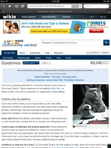
With Darwin, at tablet-sized resolutions we're removing the background. Removing the background give precious pixels back to the content space, and allows us to increase the "zoom" so the content is more comfortable to read. No background also means less to load, which increases performance of the page. Darwin also comes with a one-point increase in font size that helps the article text become more readable – especially in the case of smaller tablet devices such as the Kindle Fire HD and iPad Mini.
When the device is held in portrait (vertically), we've shifted the right rail modules to the bottom of the article to bring focus to the content and facilitate a clean reading experience. In this mode, the Search box moves above the article to keep that feature easily accessible. When the device is held in landscape (horizontally), the right rail remains in its standard position next to the content, so readers who want quick access to those modules still have them handy without scrolling. By utilizing device orientation we can offer options depending on a reader's viewing preference. Here's the same Wikia page with fluid layout, on an iPad:
Now that's a much better sight for sore eyes. Want to see for yourself? You can explore the new experience for tablets by visiting Community Central or Darwin Wikia on your devices, and be sure to let us know what you think!
While Darwin is busy enhancing the tablet experience in web browsers, there are also other ways to view your favorite Wikia communities. Check out the My Wikia app on iPad for a highly customizable reading experience.

|
||
|---|---|---|
| Read more | ||
| This blog has been reprinted from w:c:community:User blog:Susanolivia/Improving the Tablet Experience, a Community Central Staff blog. You may receive a quicker response to comments you add there than to comments added here. Thank you. |


